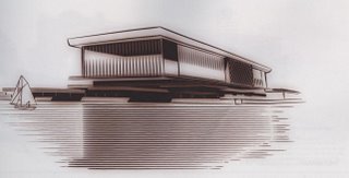
What do you think of this as a design for the new Sydney Opera House?
Well, it's a bit retro - very 50s. Not surprising, since it was designed in 1957.
It was a "commended" design when it was entered into the original design competition for the mooted Opera House.
 All I can say is, thank heavens that's not what we ended up with. I can see it when I cross the bridge every day to go to work, and although I'm quite used to it, it still surprises me sometimes. And it's an intrinsic part of the whole harbour vista. No matter how cliched the image is now, it's better than something that's stuck in time.
(Jorn Utzon's design probably baffles most people as to its genesis. In fact, he said his inspiration came from segments of an orange. Thinking about this, he has actually done an inversion of the shape of an orange segment, making the curve run obtusely instead of acutely. Not immediately obvious.)
1 comment:
i like the design, reminds me of the national library in canberra (though its a pretty generic esign so theres probably alot of buildings that look like it), certainly not an icon like the real thing
Post a Comment